At the request of one of our Patrons, today we’re going to talk about the process through which we develop our characters! If you’ve got a subject you’d like us to cover in the developer blog, Patron or not, just let us know.
Let’s talk about how we develop our character art, step by step. We’ll use Naomi as our working example.
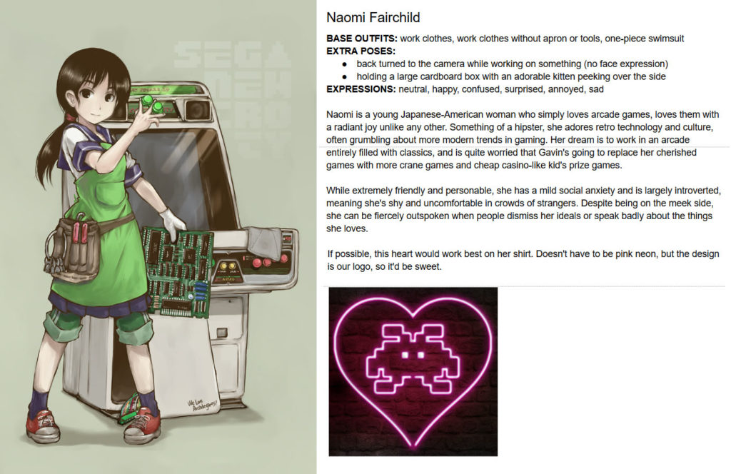
It begins with the “Inspiration” step. I search various art databases to find a character that mostly matches what I have in my mind. I knew I wanted a cute girl dressed for working in an arcade as an operator, and thankfully, I found a near-perfect match. Obviously too young, and the sailor uniform wasn’t what I was looking for, but it had the right FEEL and that’s what matters.
One design document later, and we’ve got our notes for the artist to draw from. If there’s a specific costume detail or physical attribute we need highlighted, we’ll include it here. In Naomi’s specific case we’d discussed that already in a messenger chat, so I didn’t include it here, but all I’d specified was that she needed an apron similar to this one with tools, and a skirt.
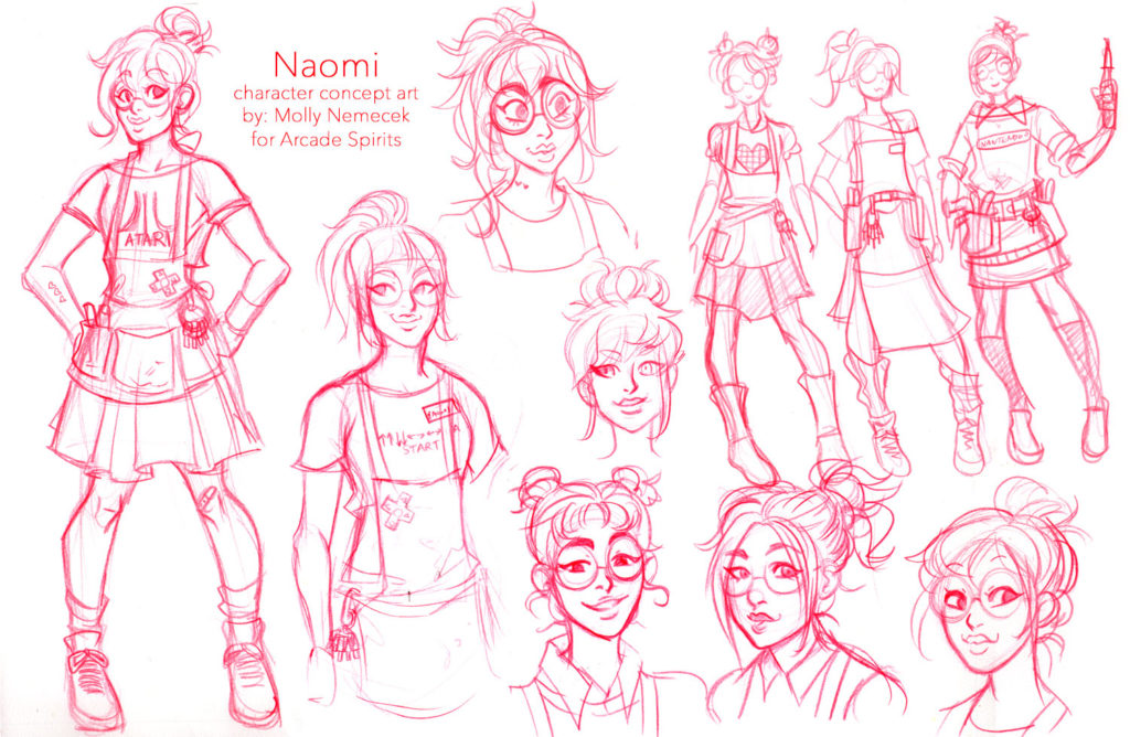
Our artist, the amazing Molly Nemecek, came back with a variety of sketches — different hairstyles and faces, different outfit variations, so we could mix and match the details that best fit our ideal Naomi!
Ultimately we decided to remove the D-pads and other console game references, since Naomi is wholly focused on arcade titles. Otherwise, this was right on the money, and the main outfit variant fit perfectly. For hair we decided the bottom middle worked best, since it was both messy (since she doesn’t care much about her appearance) and pulled back (to keep from messing with her work when leaning over a circuit board). We added the nametag from the variant outfits, which felt appropriate for her work attire.
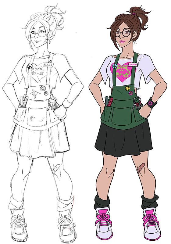
With the specifics decided, Molly created a full final sketch. With a thumbs up on that, a flat color version was produced, to make sure it looked just right. Naomi’s primary color would be green, we’d decided, green like printed circuit boards — and matching the green text she used in-game. We want each of our core seven cast members to have a unique text color, which is represented in their artwork.
(All of the core cast had full-body art, even though in-game they only appear from the thighs up. This way we could use them on merchandise and signage at conventions and such.)
The final step was to animate Naomi, adding facial expressions, arm poses, and alternate art versions such as swimwear and casual clothes. Buuuut, to see that, you’ll have to play the game!
Overall, we value collaboration. We like to let artists play around, come up with variations on an idea. Often we get surprises that way which end up making it into the final art. For instance, we hadn’t specified a nametag; Molly came up with that on her own. While Naomi was largely defined going in, other characters we had few ideas on, such as Teo. Molly designed his 90s-esque dance outfit, based only on ‘some sort of hot dance clothing.’
By moving from inspiration to sketch options to final sketch to coloring, we refine the character, little by little. In the end, we get a wonderful piece of art that fully represents the character.
Hope you enjoyed this peek into the process. Let us know if you’d like any other tales of game development!


