Okay, now that I’ve embedded Don’t Stop Believin’ in your heads, let’s talk about streetlights. And lights in general.
The September Patreon beta update is a big one — literally big, as in inflating the game by 100 megs. But for good reason! I finally sat down and did a huge overhaul to nearly every single background in the game, to add lighting effects and other subtle animation cues. Little things that bring the otherwise static images to life.
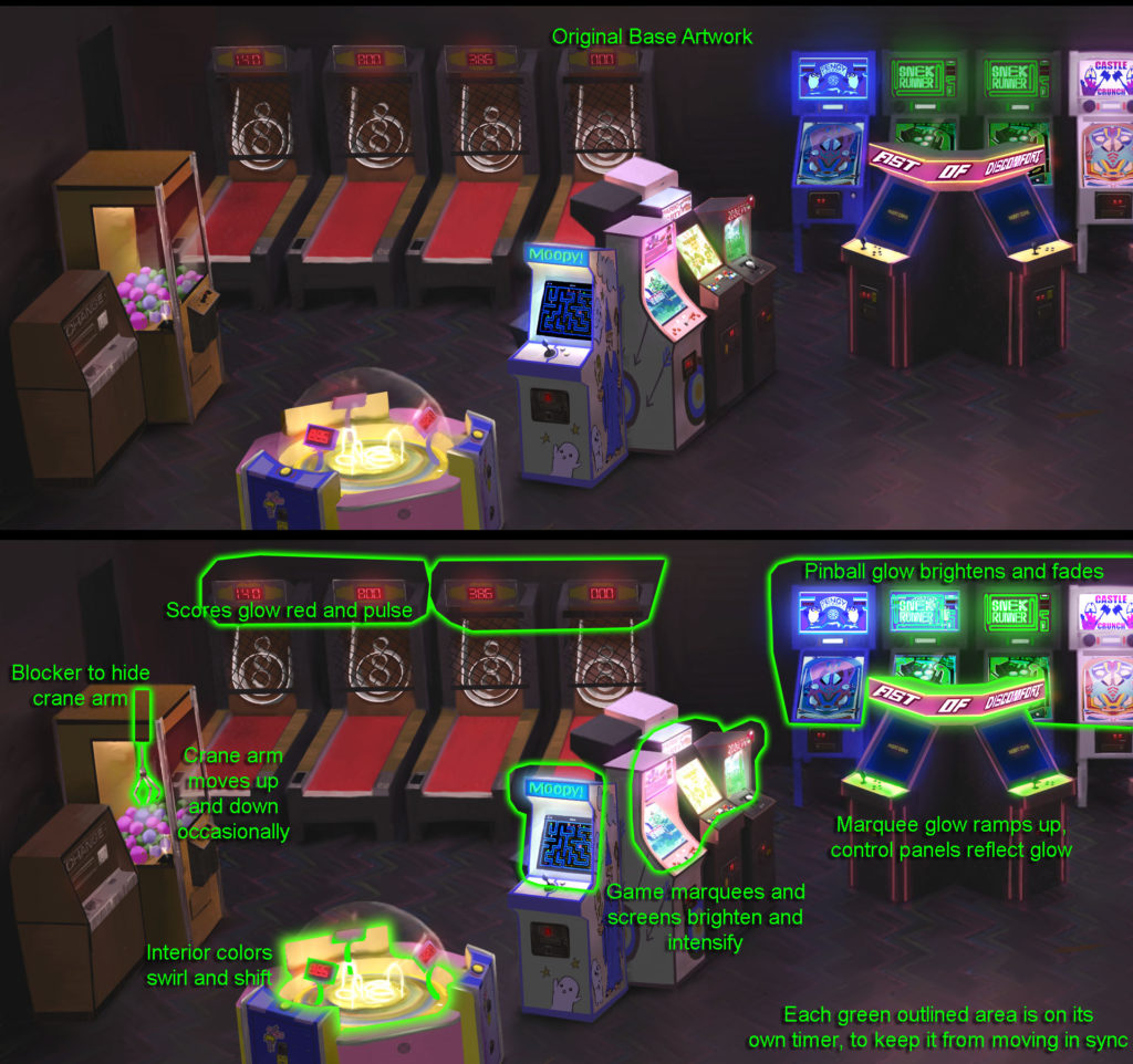
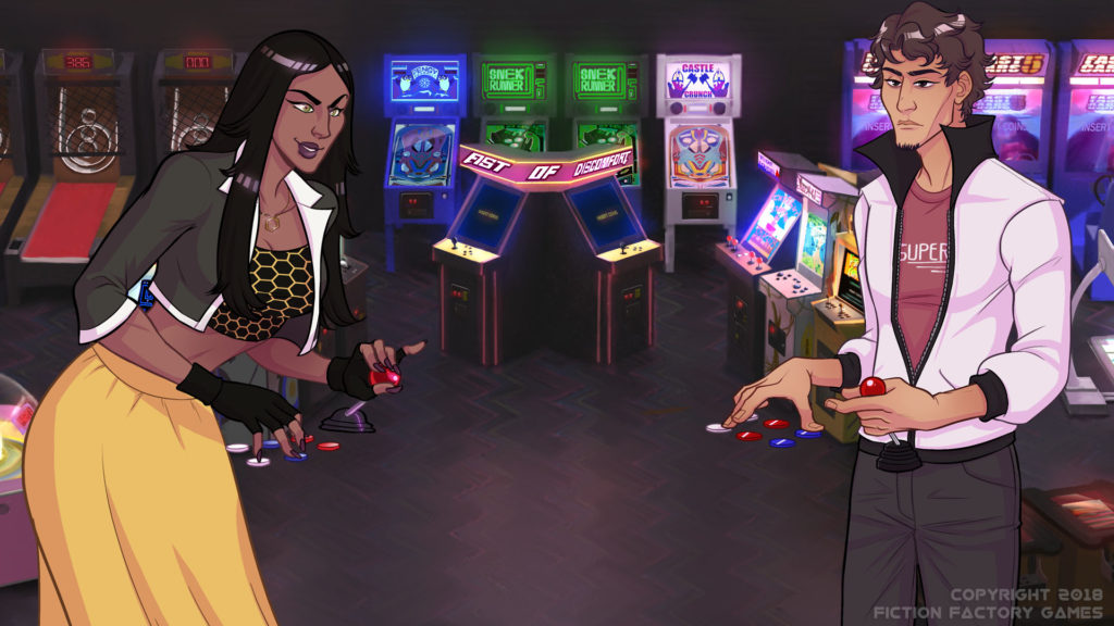
Today, let’s go over three scenes, and how they’ll be different under the new animation. First, we’ll look at the Funplex.
The Funplex has three main effects going on. The first, and most commonly used across all the revamped backgrounds, are glowing elements glowing brighter than before, with the extra glow fading in and out softly. It’s almost impossible to see unless you’re looking for it, but adds some life to the scene. next, the prize game at the bottom left has a shifting color scheme, to reflect the lights inside the game changing colors. Finally, there’s a simple animation of the UFO Catcher crane lowering and raising.
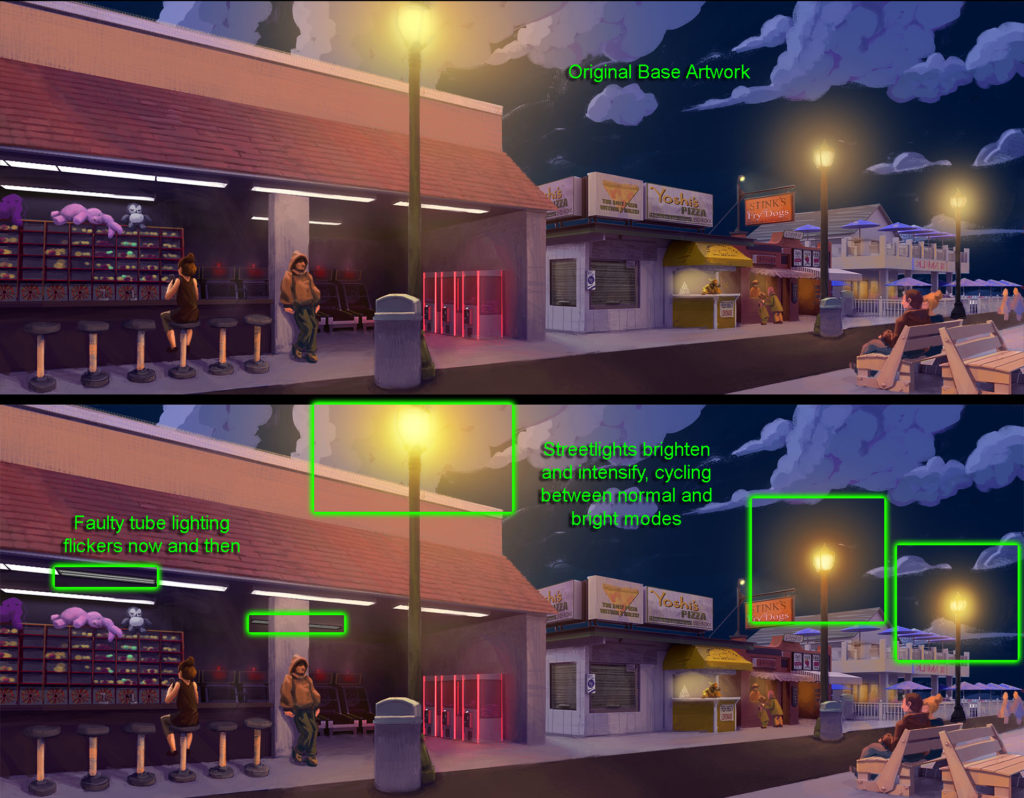
Next let’s go to Flotsam Beach, home of the Obligatory Beach Episode Where Everybody Wears Sexy Swimsuits.
The streetlights (in the niiiiiiiight) pulse, in a bit more obvious a fashion as this is an old Mid-Atlantic beach town under disrepair. Similarly, some of the tube lights in the arcade will flicker, showing the double tube bulbs before turning back on full strength. I considered a cloud animation, since the clouds animate during the daytime scene, but figured the lighting was more important.
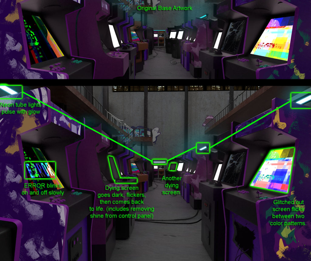
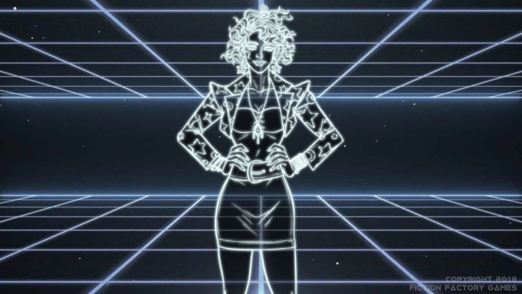
Finally, let’s look at a scene from later in the game, which I won’t spoil beyond showing you this vague image…
Lots of stuff going on here — glitched out game screens, pulsating neon lights, error codes, and more. It’s a flashier scene, to be sure.
“But wait!” you might say, as I’m pouring the gasoline and getting the match ready. “What if I don’t want to be distracted by fancy background effects? Also, put down the matches, please.”
Not a problem! Here’s our revamped Preferences screen.
Not only did we improve the ‘Style’ option to show you what each of our three UI styles looks like, but we added an option for the background animations. It defaults to Slow, which should provide ambiance without being distracting — but you can turn them Off completely, or even make them Faster if you want something flashy and fun! It’s up to you.
As we finish up the story and start polishing up the game, we’ll have more new features to show you — including a pretty big one which we’re not ready to talk about yet. Let’s just say there’s a reason I had to crop down the Preferences screen…
